2023 COD Conference
According to the website, “With each Co-Occurring Disorders Conference we continue to strive to bring together experts from Washington and across the nation to share information about innovative therapeutic techniques, skills, programs, practices and policies that offer a relevant and enjoyable learning experience. Our goal is to promote integration of services across the public mental health, substance use disorder, developmental disabilities, and medical systems; promote knowledge about co-occurring disorders and the value of integration, to support the development of a co-occurring capable system of care, and to advocate and partner with others to promote integrated treatment and recovery for all people. Finally, we strive to present each participant with current information that will bring value back to the agency and the patients they serve, and to provide a great opportunity to network with friends and colleagues.”
Logo Design
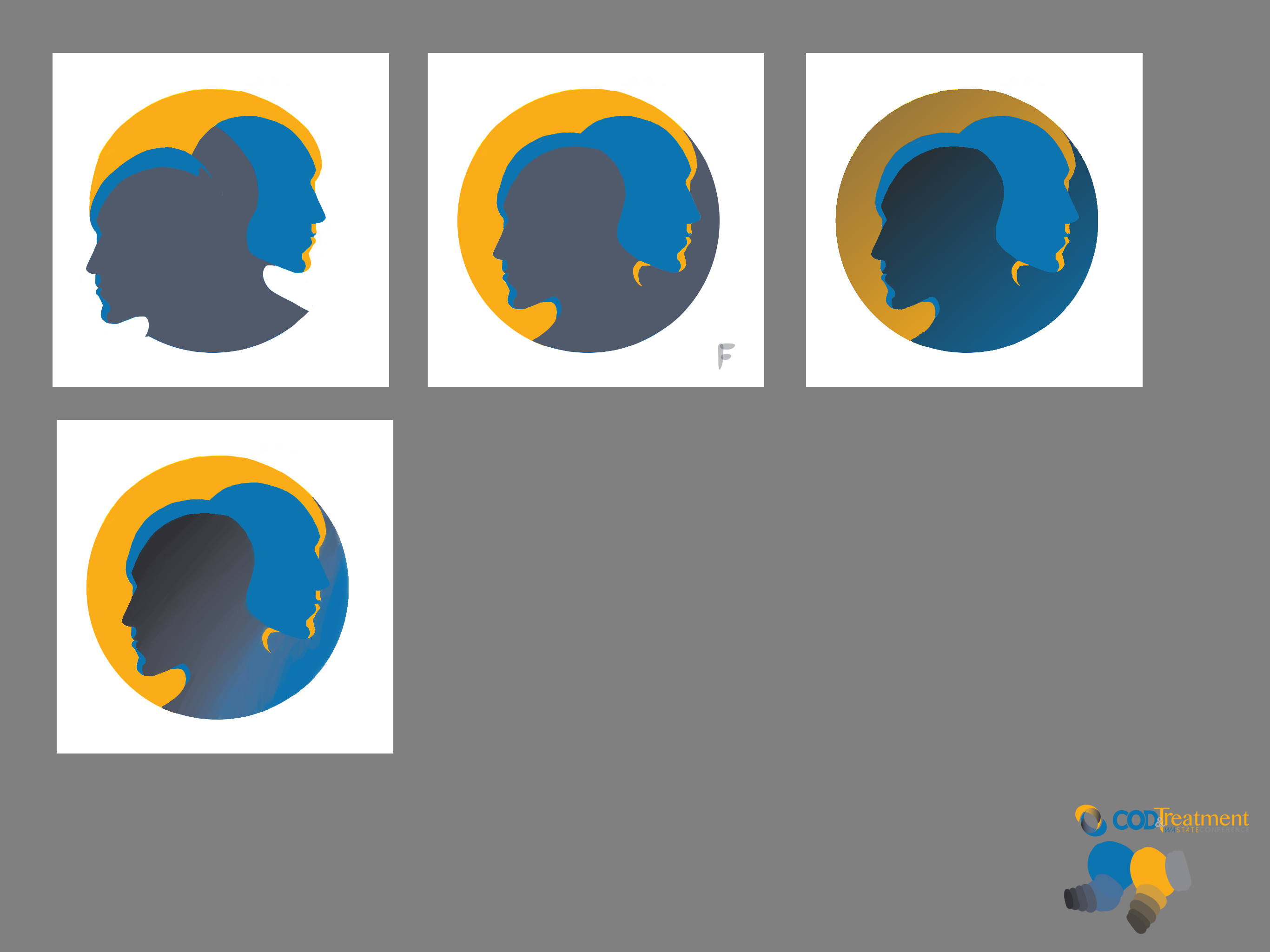
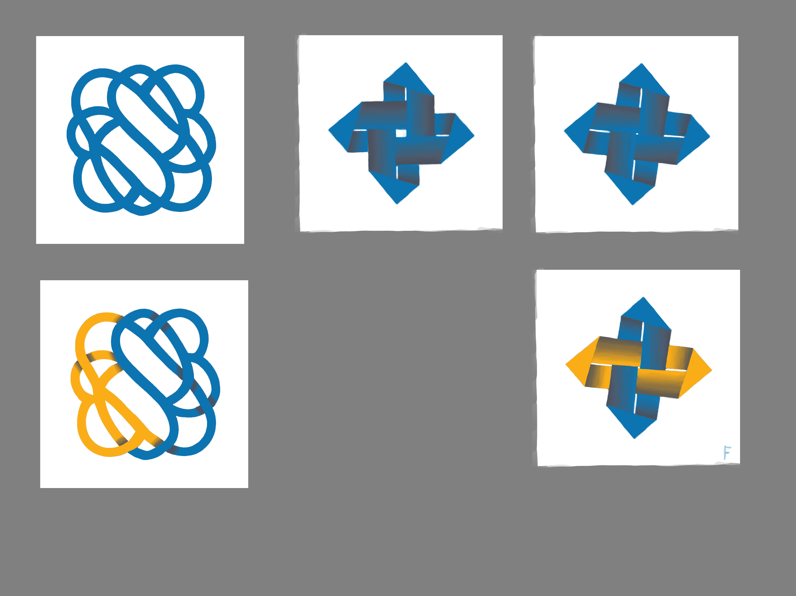
For this conference, the client requested a year specific logo with the theme of “Stronger Together”. They were quite vague with the specifics so I came up with 4 logos of varying styles. I started by sketching them up on my iPad so that I could get the colors correct as well as give the client a better idea of what the final design would look like. The color theme for COD is blue and yellow, so I tried to incorporate that into all of the designs.
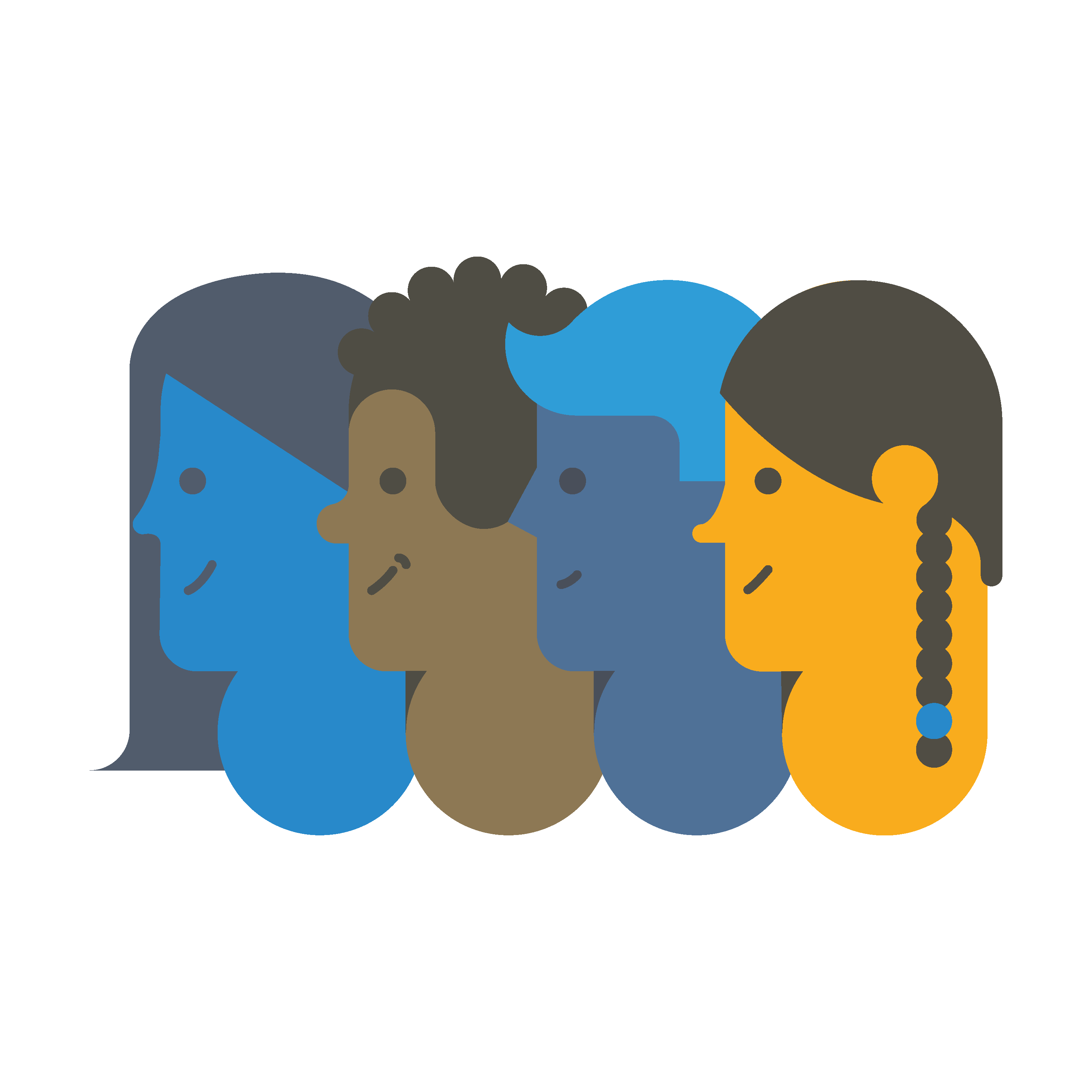
Even after reviewing the logo sketches, the client couldn’t decide, so they requested finished versions of each. I created the final designs in Adobe Illustrator and, while working on them, quickly came up with another logo featuring just side profiles.
The client ultimately chose the logo with the cartoon faces, which I was elated about since I later got to illustrate them further for the cover. While creating so many logos might seem frustrating, I actually enjoyed the process and learned a lot about logo design along the way!
Program Design
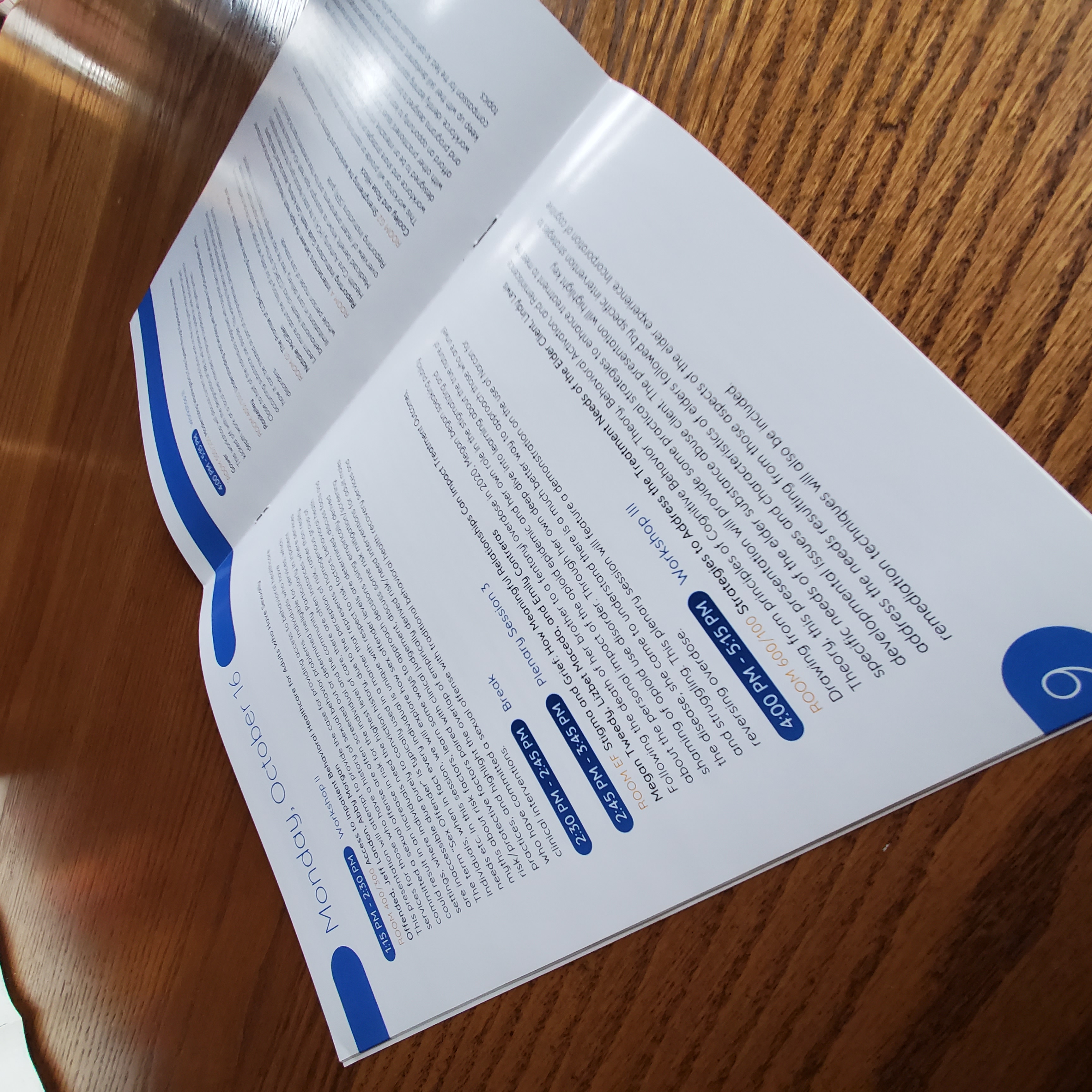
For the program design, I created a scene featuring all the characters helping each other up a mountain to capture the “Stronger Together” theme. I started with sketches and finalized the design in Adobe Illustrator. For the inside pages, I chose a clean and simple layout that was easy to read. I also handled the layout and copy, editing grammar and shortening descriptions submitted by the speakers to ensure clarity and consistency.
Name Badges and Certificates
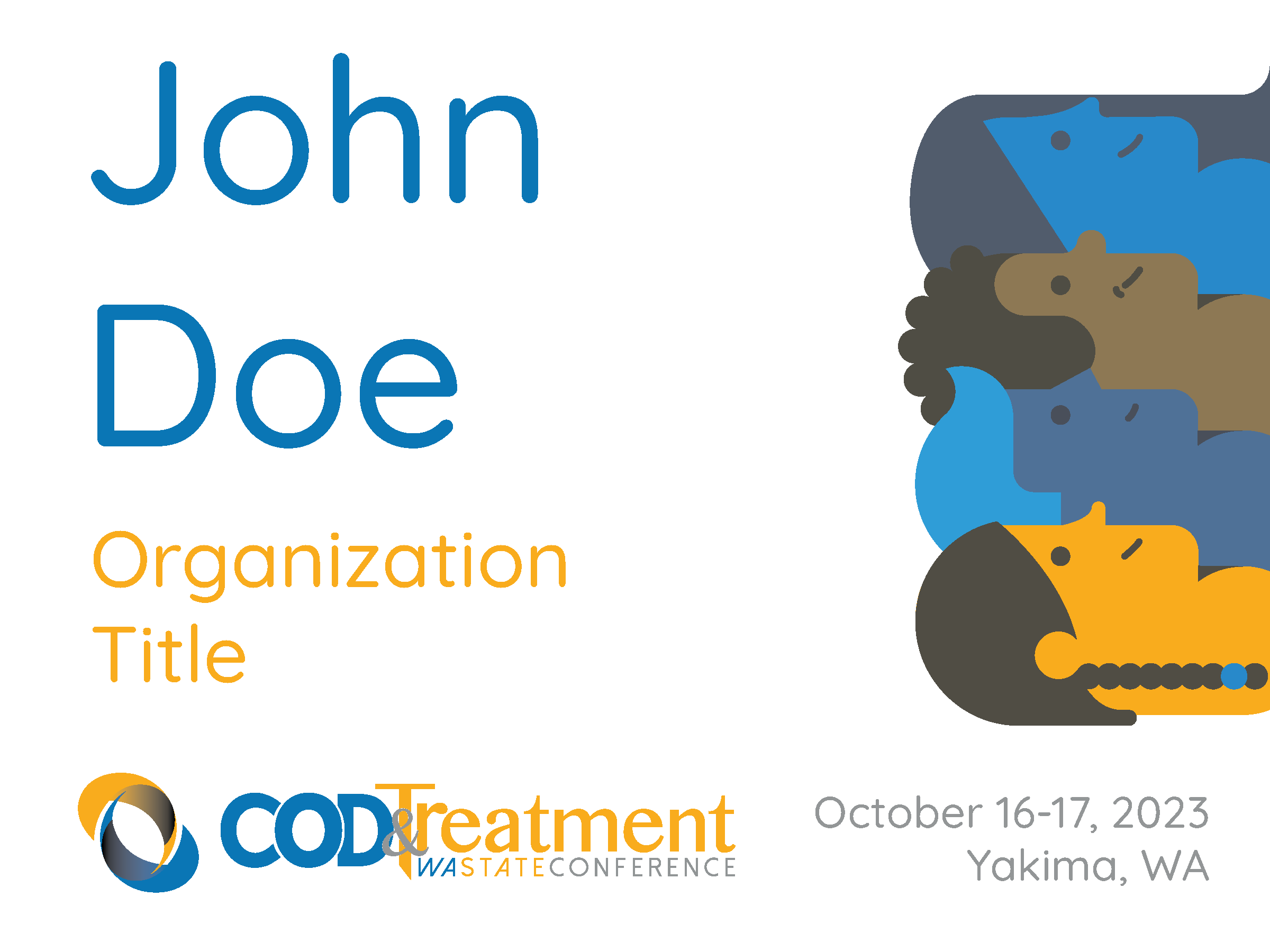
For the name badges, I kept the font as big as possible for ease of reading and added the logo. With the certificates, I tried to make them as readable as possible while still having room for the required elements and logos. Unfortunately, I didn’t get to design any signage this year as COD already had reusable signage.

