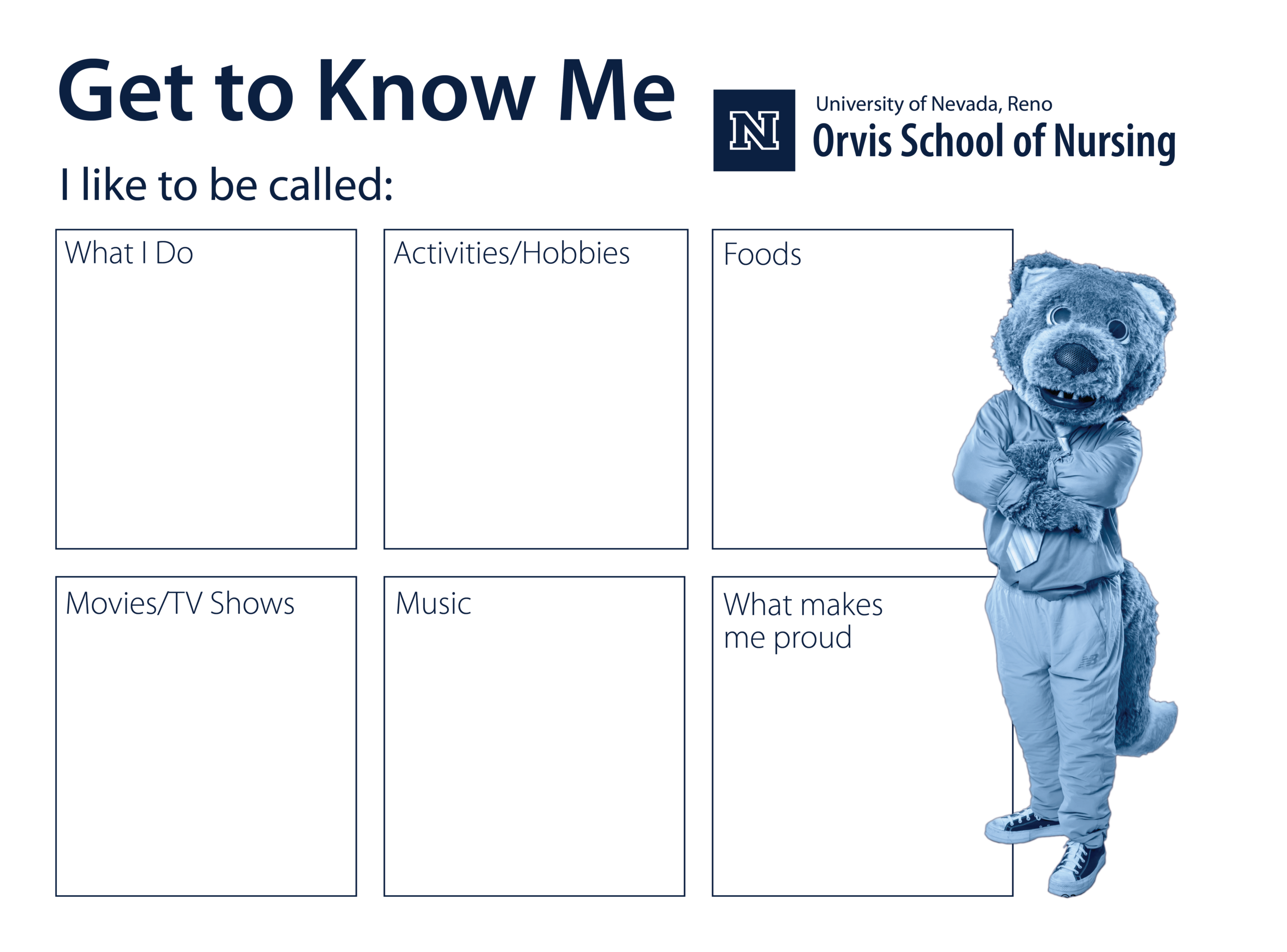
During my time at the Orvis School of Nursing, I was fully in charge of the design and marketing for things like the program handouts, and it came with a lot of responsibility because the brand and image of the school genuinely matters. It can make students’ degrees feel more prestigious, which can translate into better jobs and better pay, and it also shapes how the nursing school is viewed on a nationwide level. It was never just about getting people to enroll. It was about protecting and strengthening the reputation of the Orvis School of Nursing and the University of Nevada, Reno as a whole. Because of that, I took it seriously and really cared about doing it well, but I also wanted the design to be something I actually liked. When you’re making materials you don’t even believe in visually, it stops being fun, and you lose that passion that makes the work look sharp in the first place.
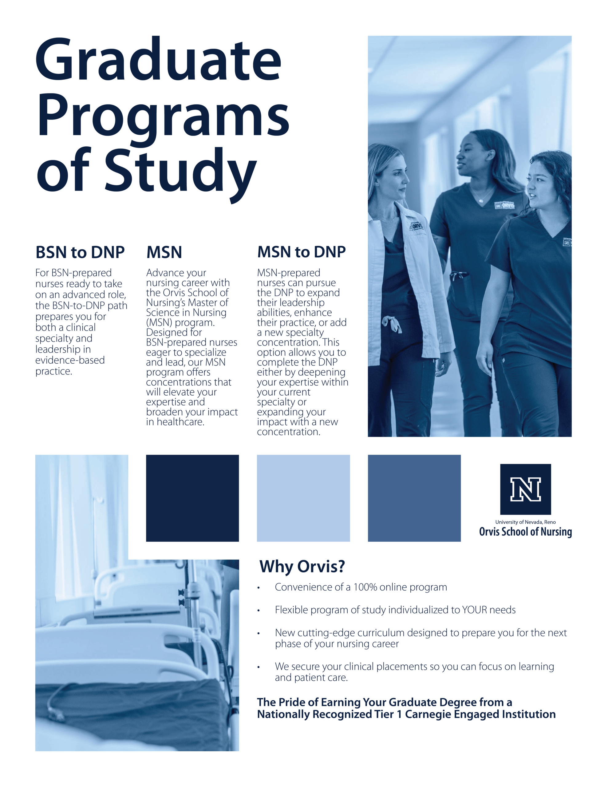
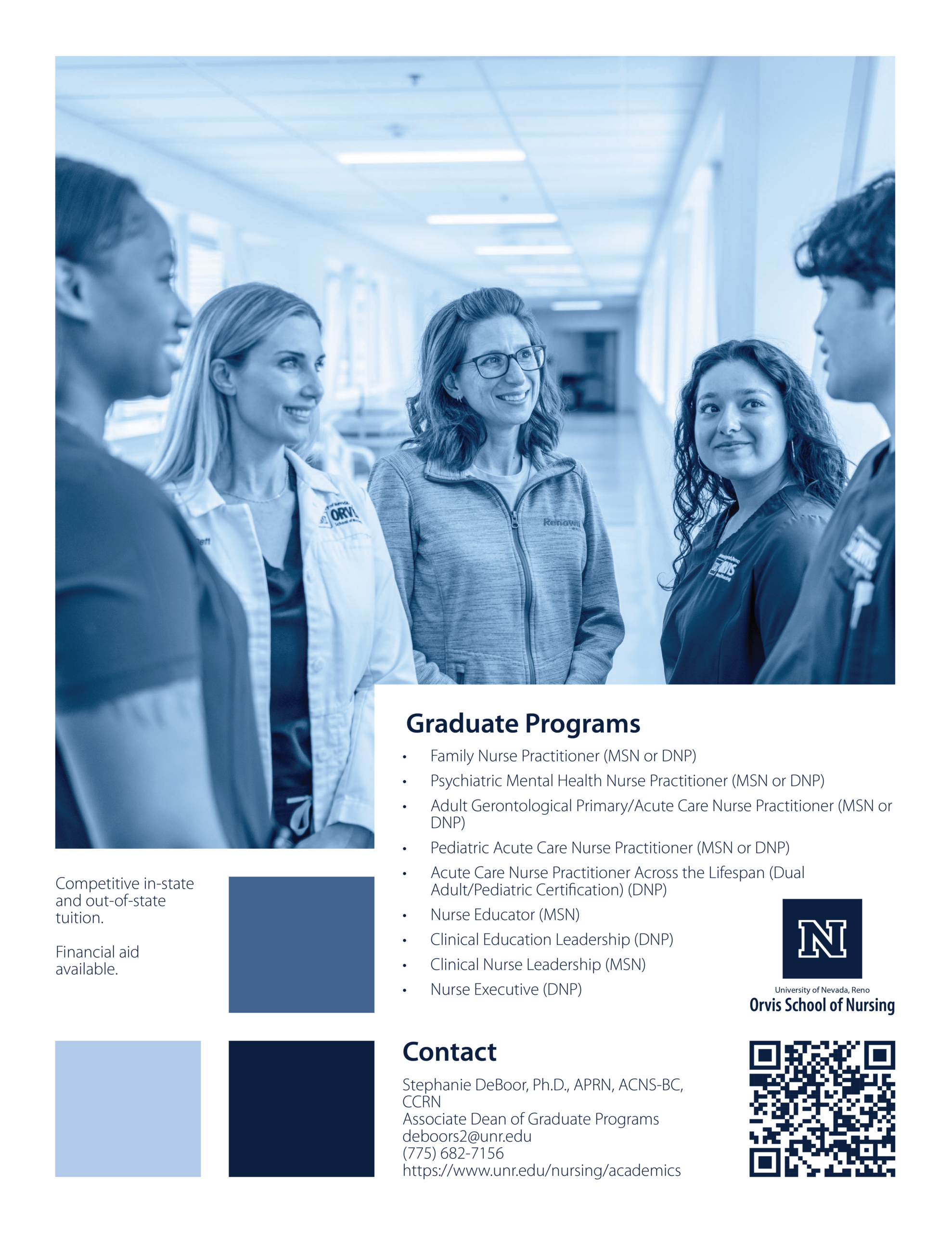
After talking with the Dean, we agreed we wanted Orvis to have a serious, scholarly brand image. We intentionally avoided the typical posed, overly smiley photos and leaned into visuals that show nurses as they really are, on the front lines doing hard work and saving lives. A lot of competing schools seemed focused on making every photo look like everyone is just having a great time, but we wanted our handouts to communicate something more real: this is rigorous, meaningful work, and Orvis nurses earn it.
My First Work: Legislative Handouts
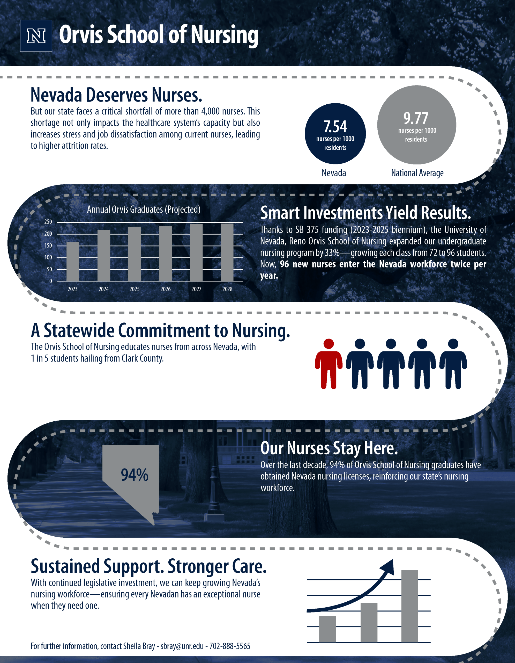
One of the first projects I worked on when I started my job at Orvis was creating handouts for Nevada state legislators in Carson City. Since they oversee funding for the schools at UNR, these materials were a big deal and needed to land well. The handouts had to clearly show why Orvis needed more funding, while also highlighting what we had already accomplished with the resources we had. When I designed both pieces, I focused heavily on visual appeal and clarity so that even if someone only skimmed or scanned the page, they would still immediately understand the main points. I also worked closely with faculty and the Dean throughout the process to make sure the messaging was accurate and aligned with what we wanted to communicate.
Legislative handout front.
Back.
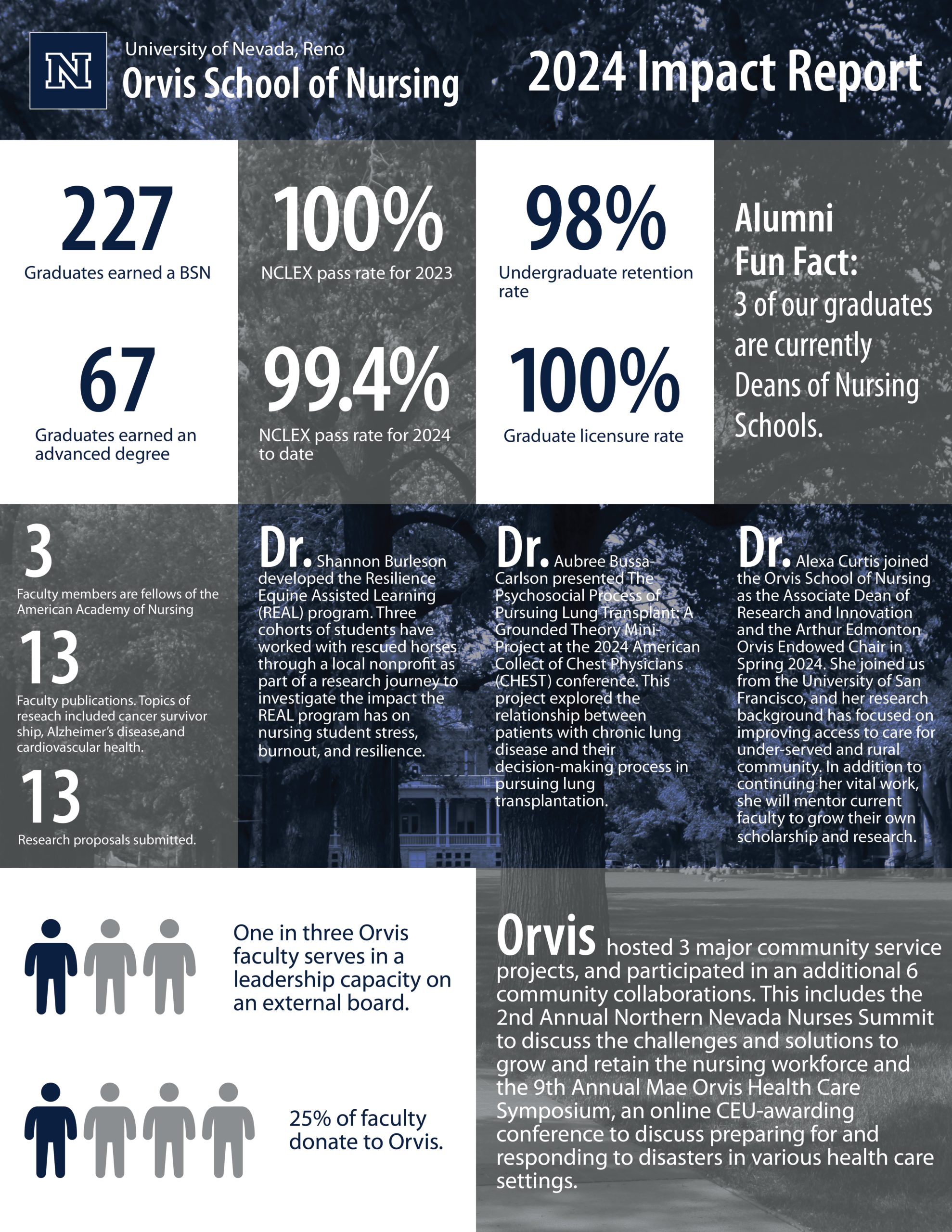
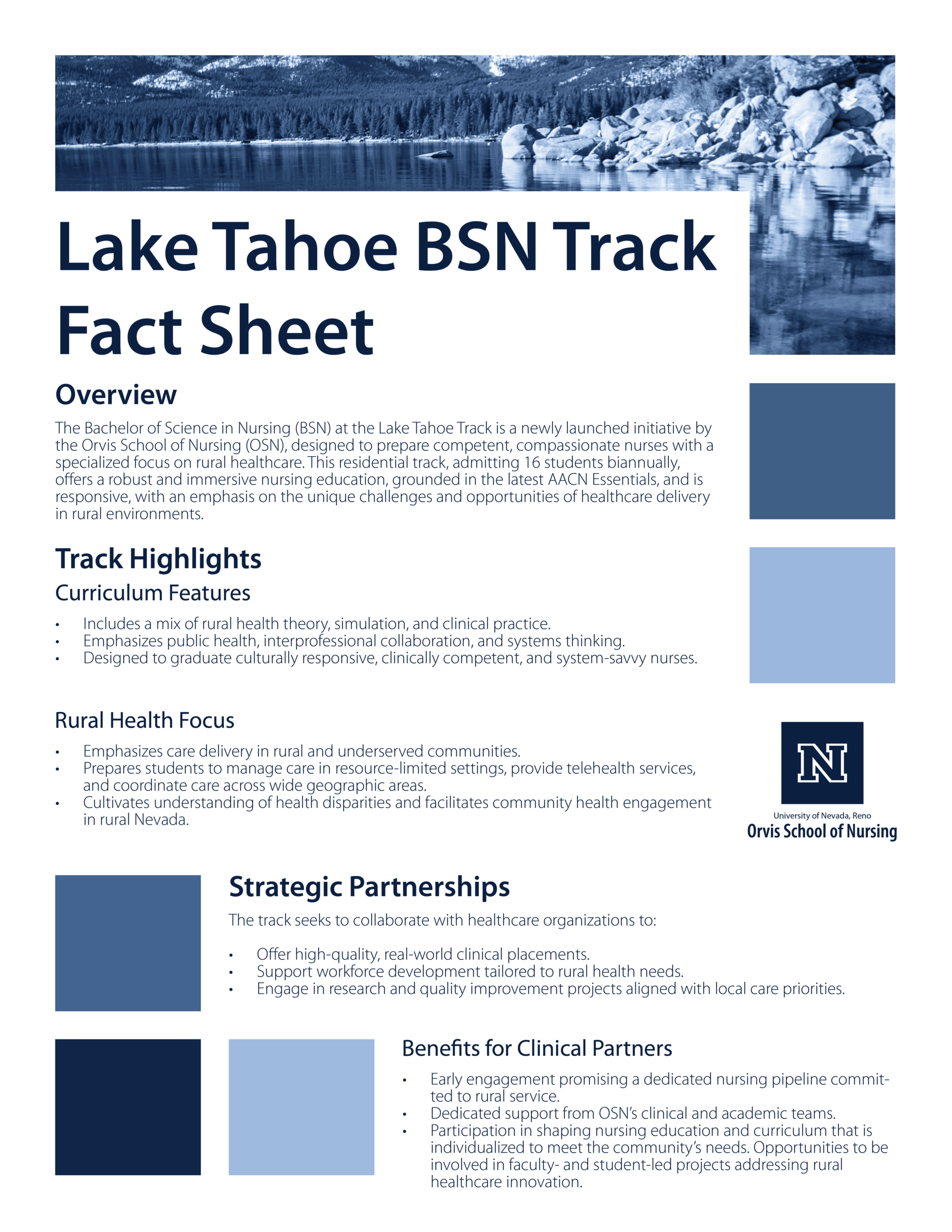
Impact report front.
Back.
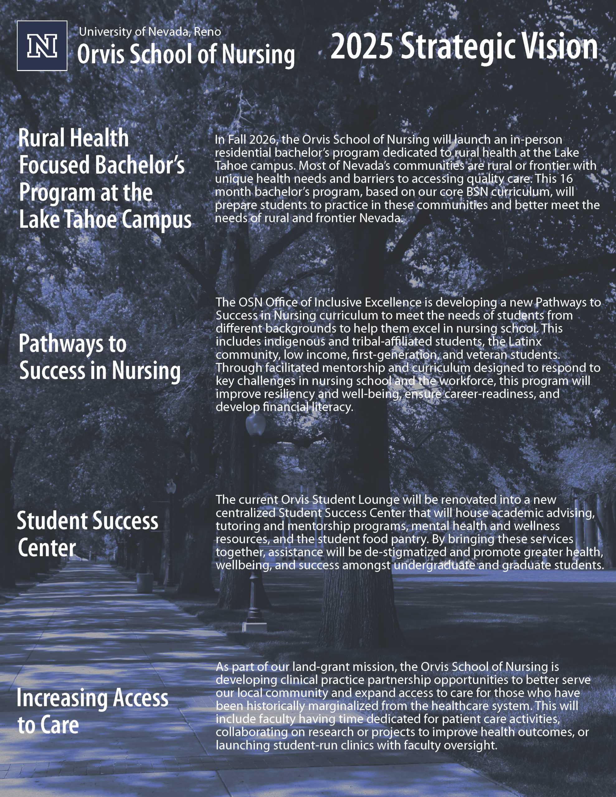
This was one of my first times working in the University’s design guidelines and I learned a lot, but it looked to basic and lacked distinction. So I was back to the drawing board for inspiration.
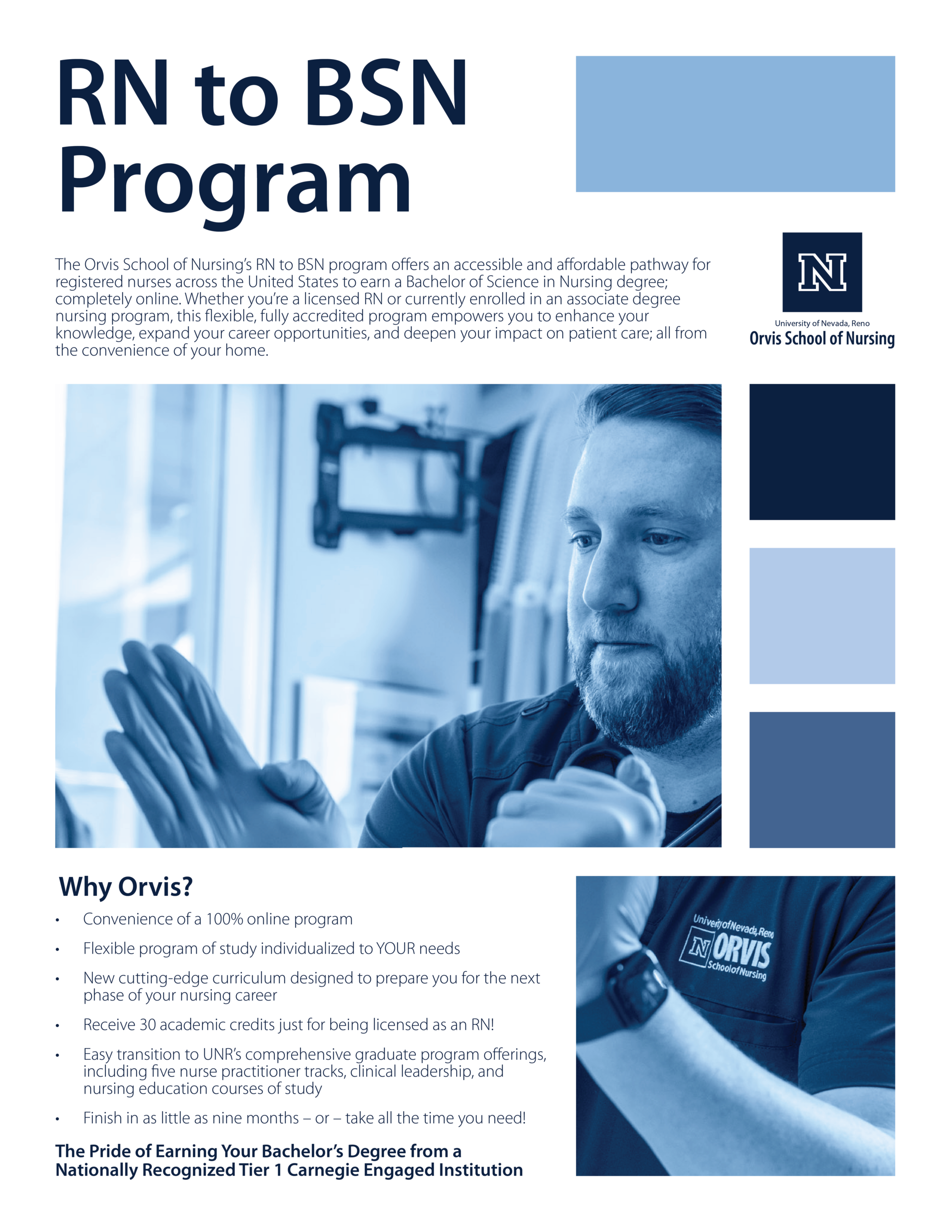
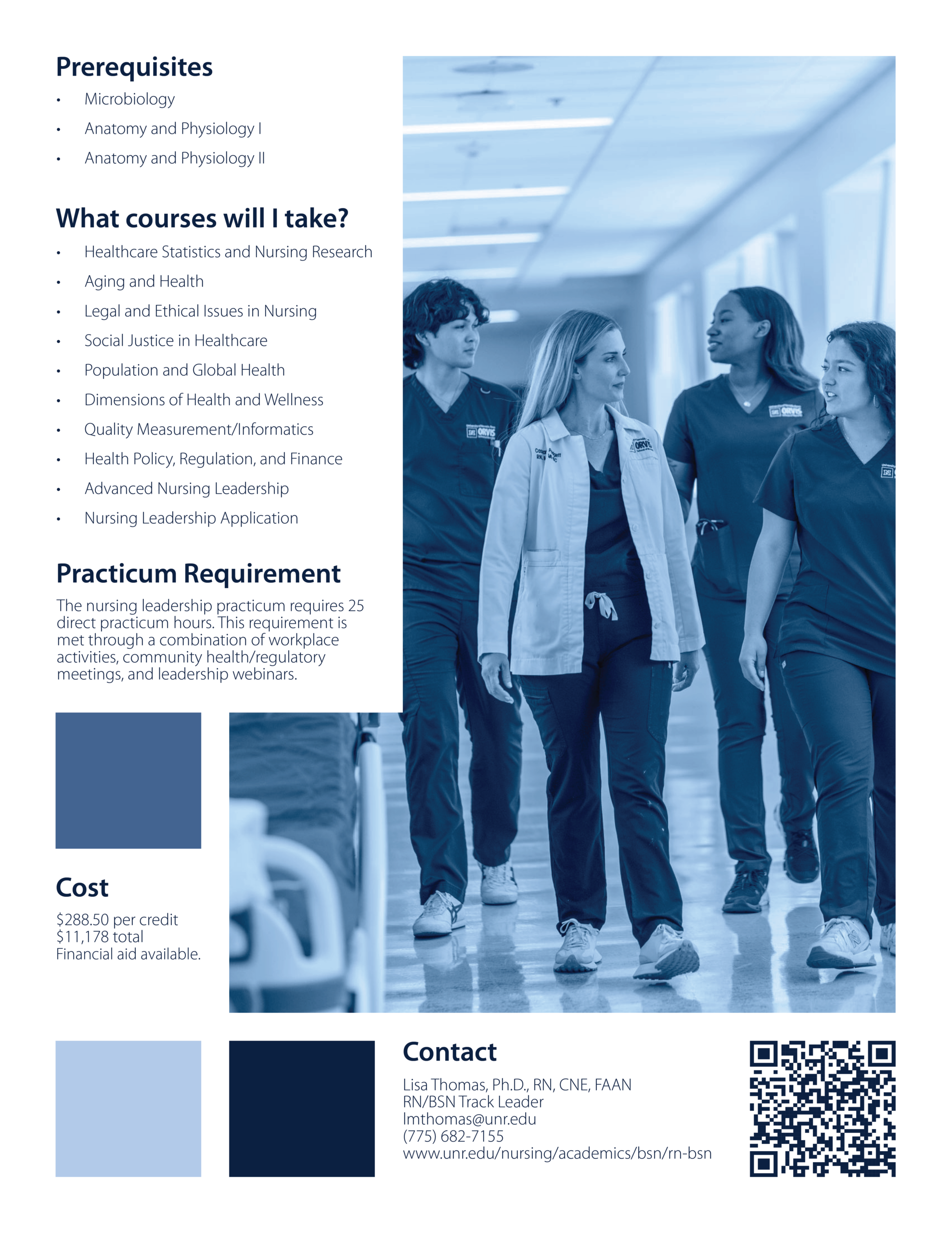
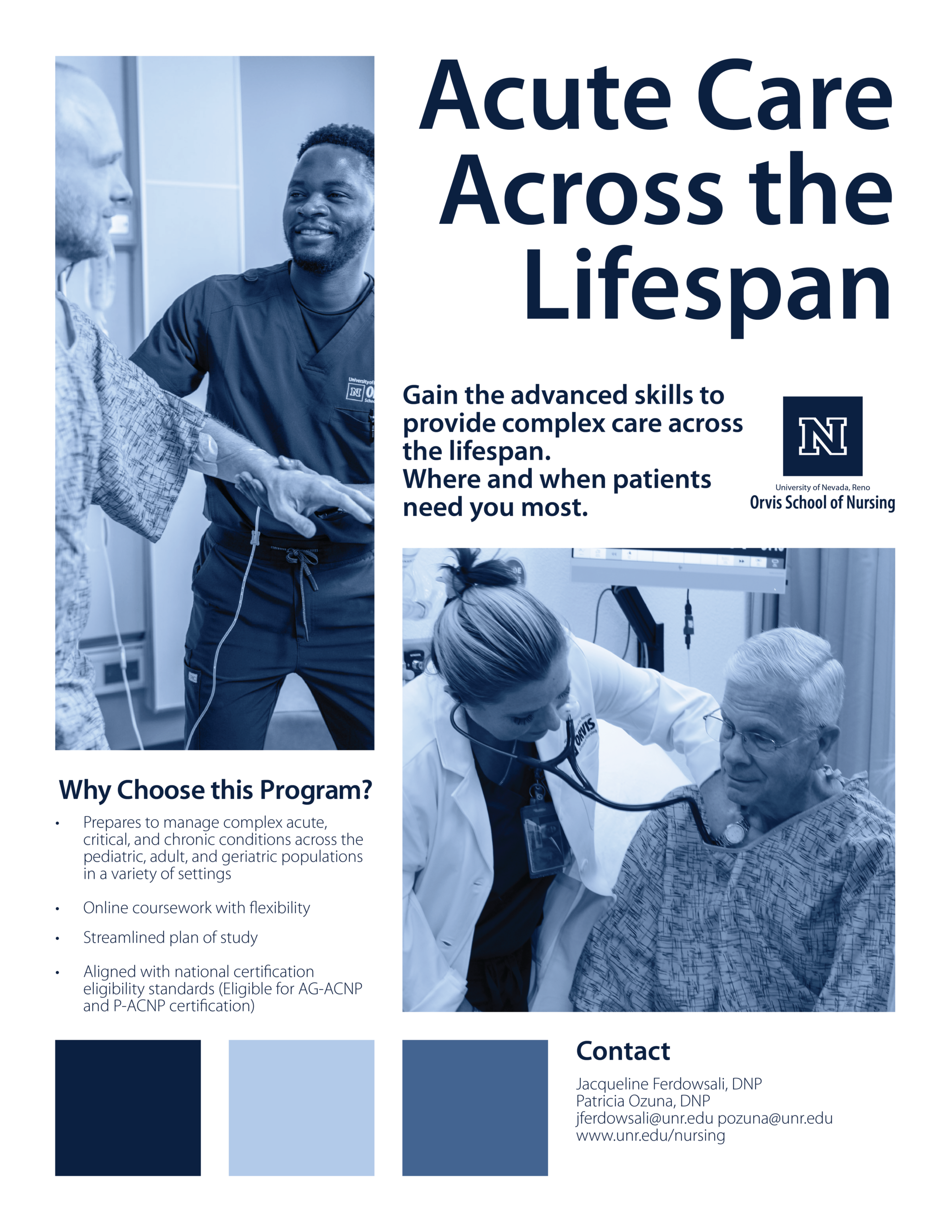
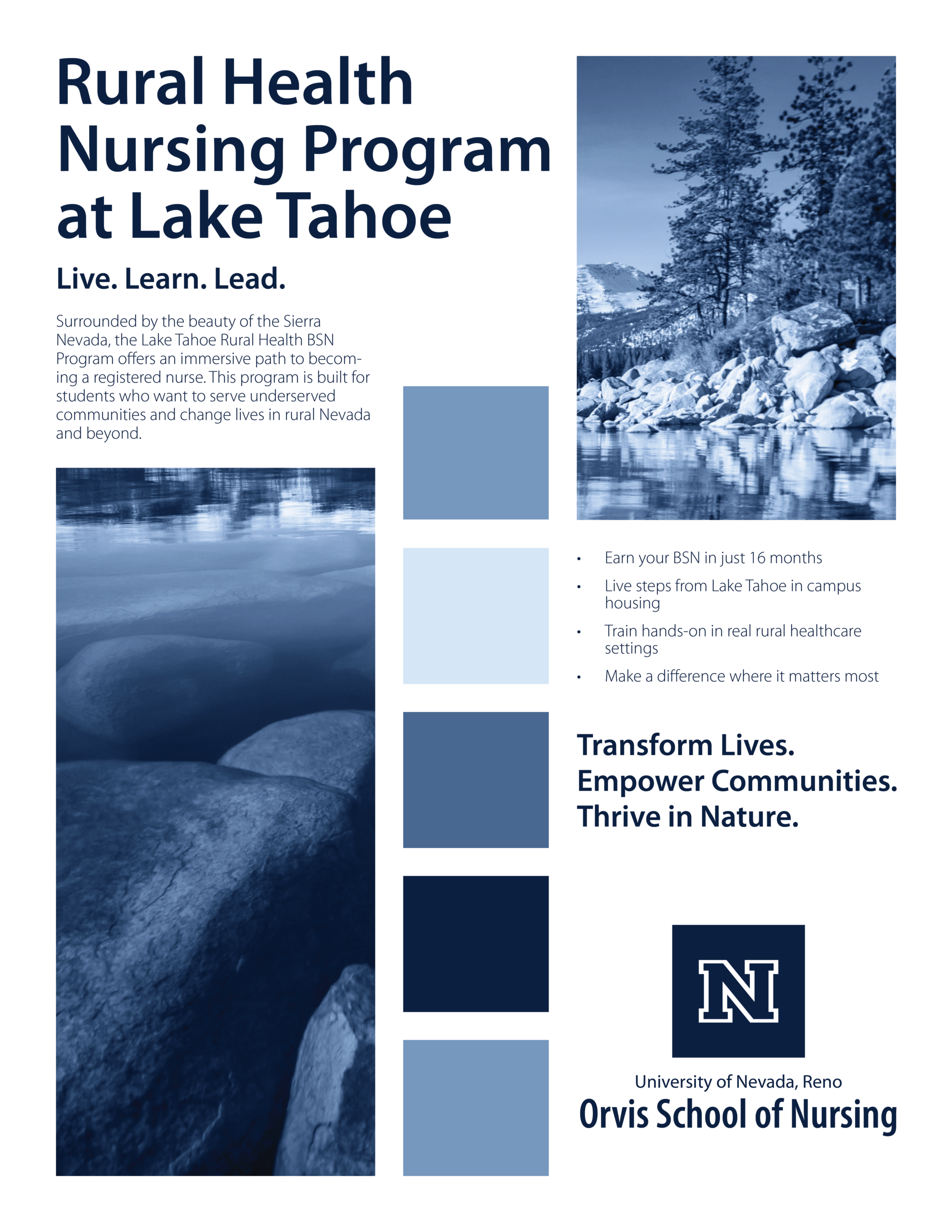
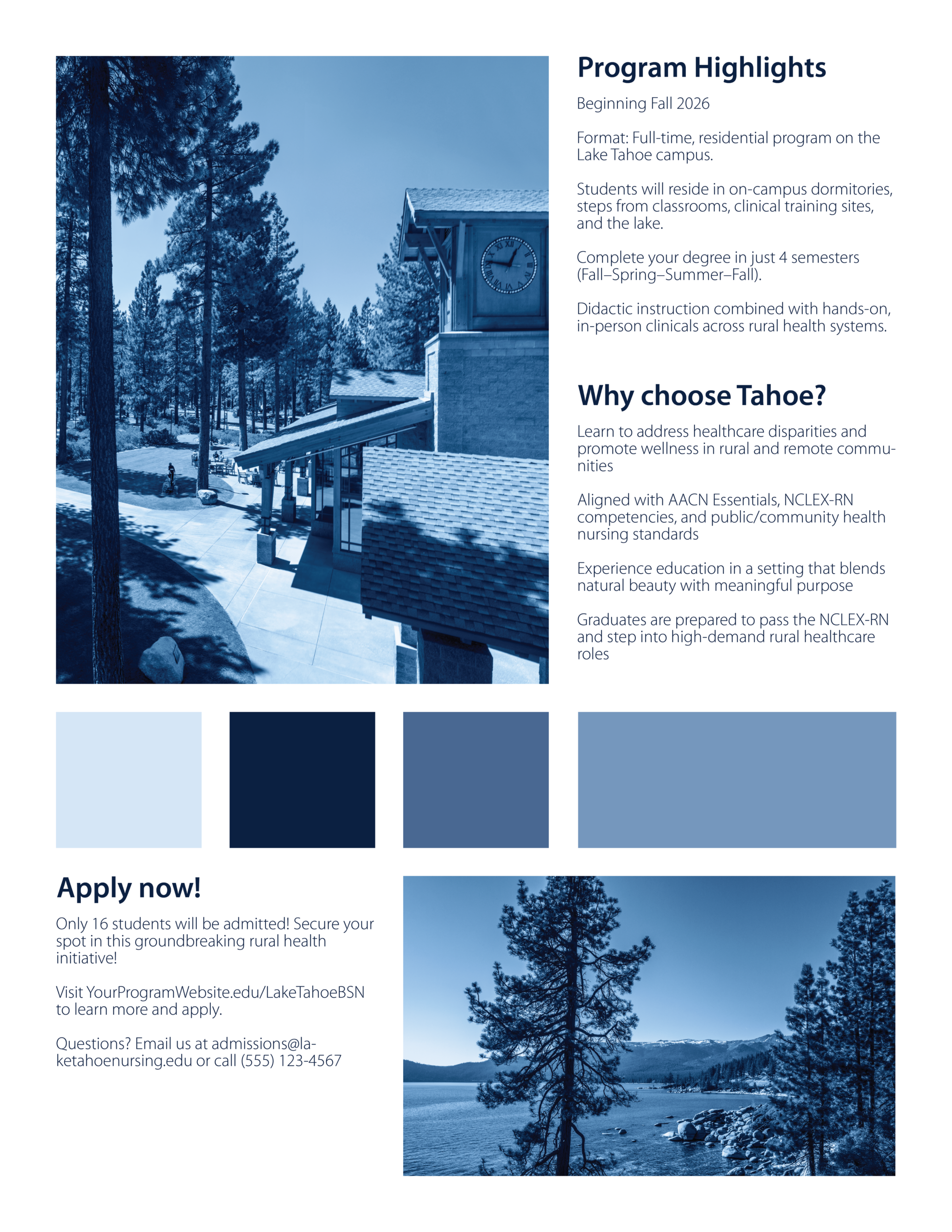
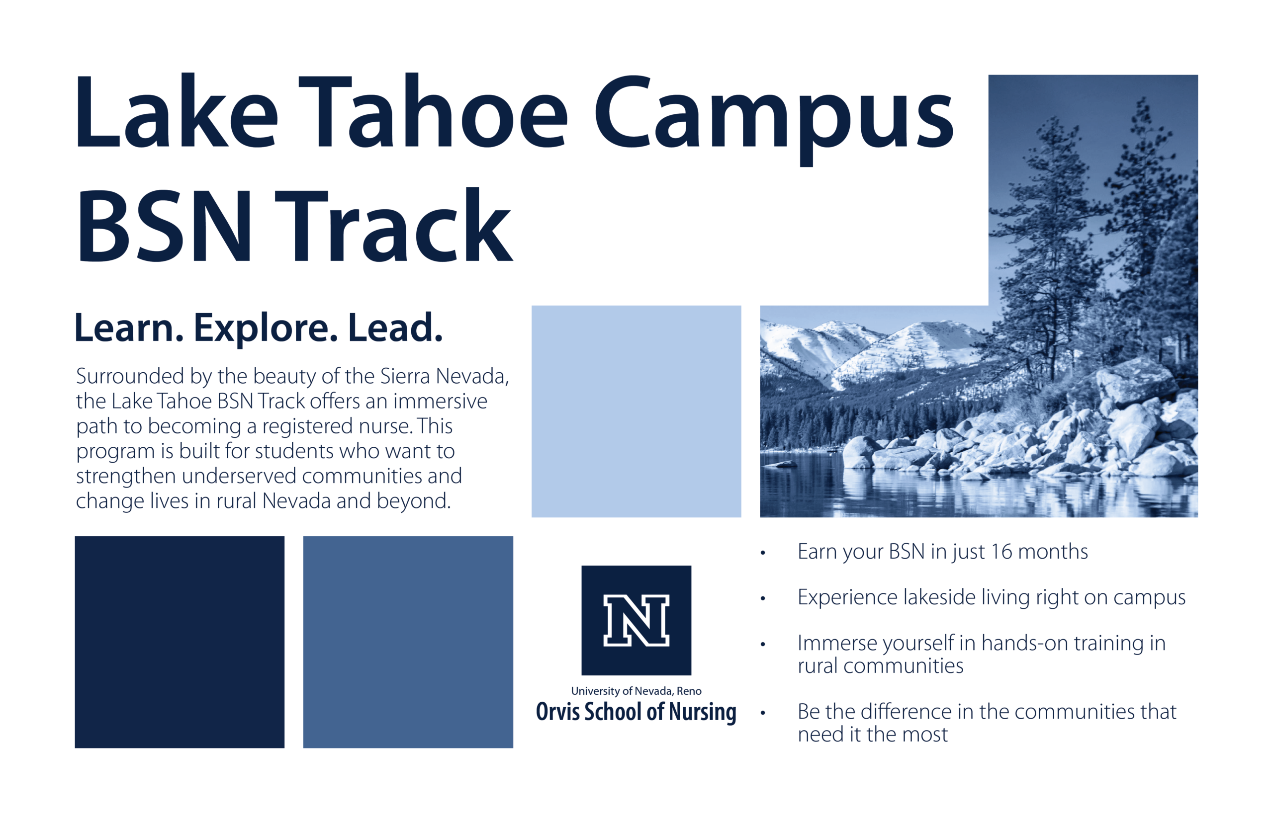
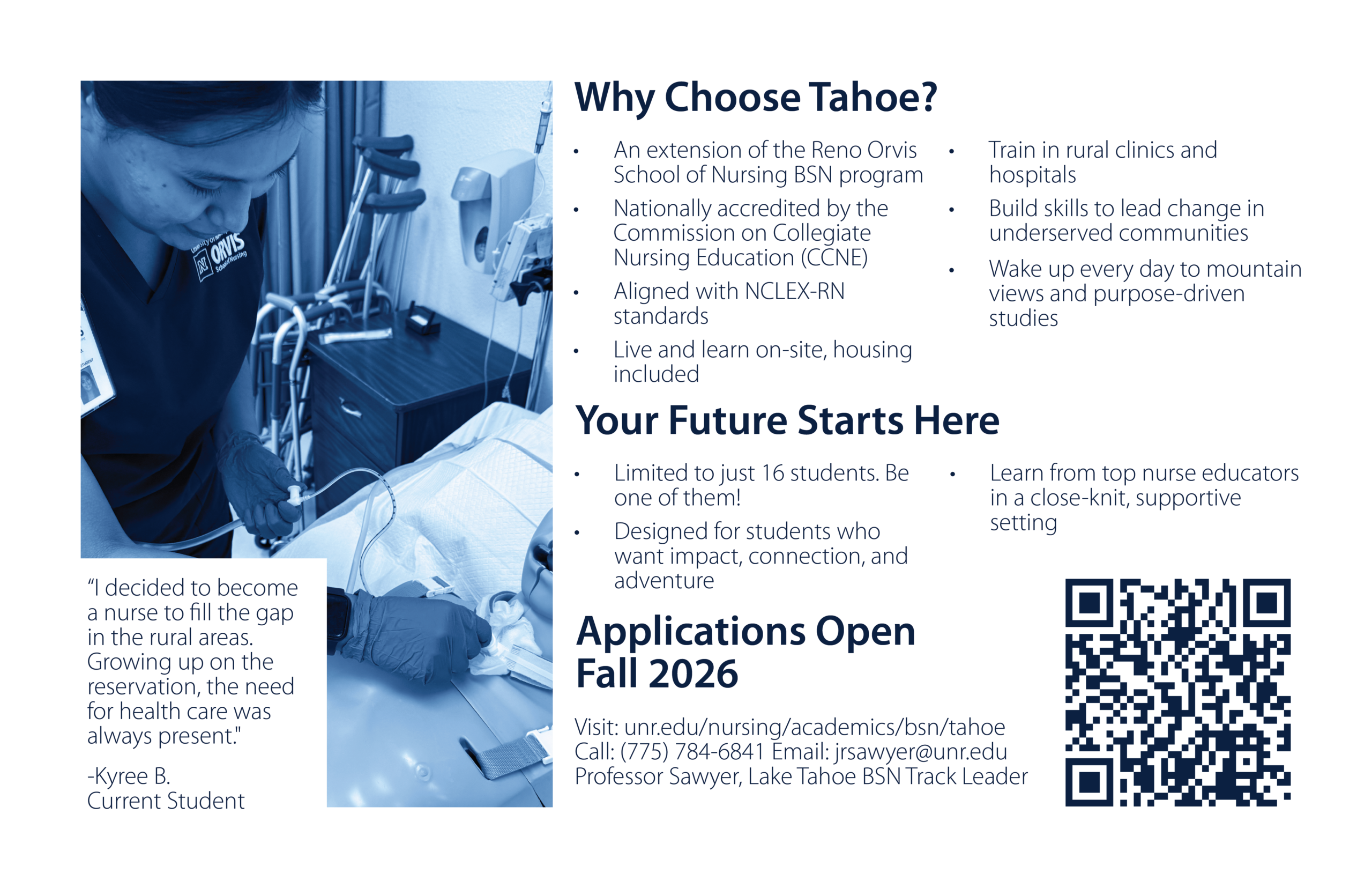
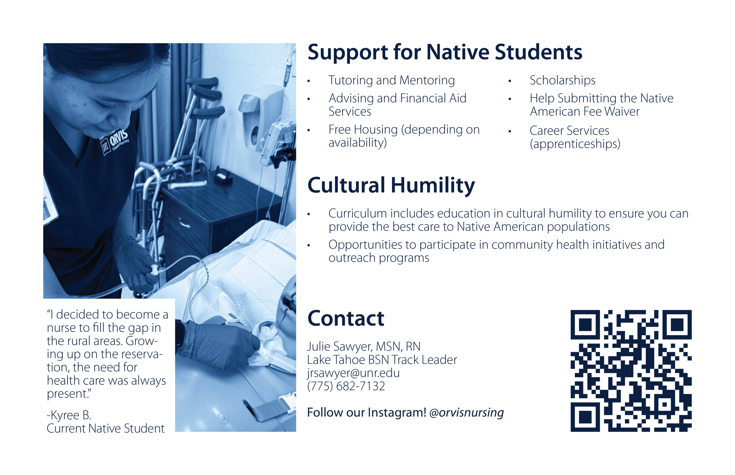
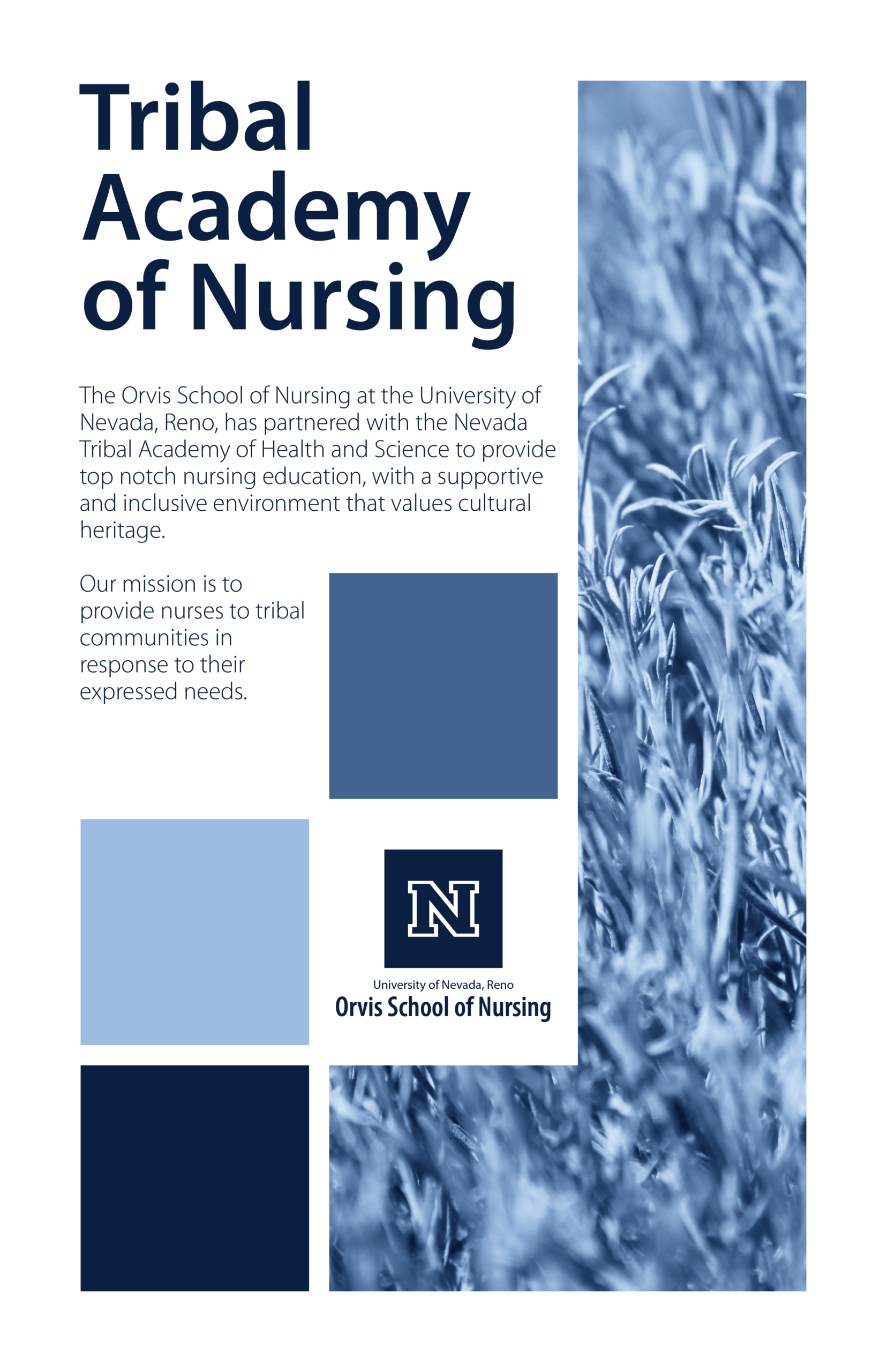
The Final Design: Swiss Gen X Soft Club
After doing the first round of legislative handouts, I realized I did not actually like the style they landed in, and I wanted to push for something that stood out more. I wanted an edgier look, but not in a way that felt over the top or out of place in an academic environment. That is why I pulled inspiration from Gen X Soft Club (Consumer Aesthetics Research Institute), because it has a really cool visual style while still feeling professional and controlled. In my opinion, the era of boring flat design is fading, and people are more drawn to the more experimental design language that came out of the 90s and early 2000s. At the same time, you cannot go all the way with that, especially for legislators and an educational setting, so I was very careful to keep it tasteful and not push it so far that it started to look silly.
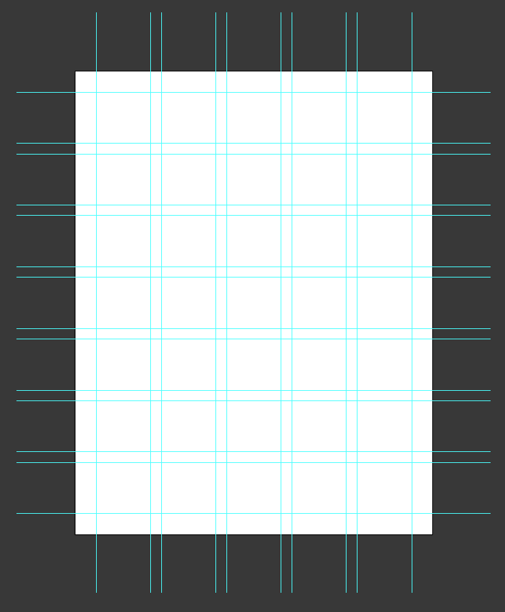
Swiss grid layout I came up with.
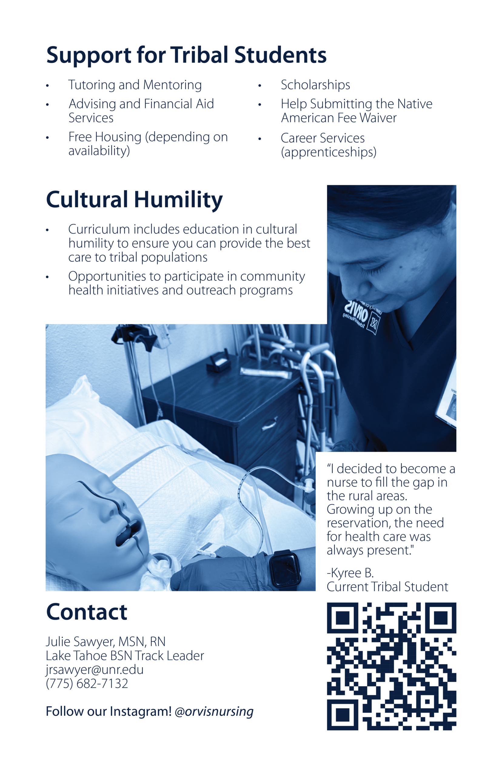
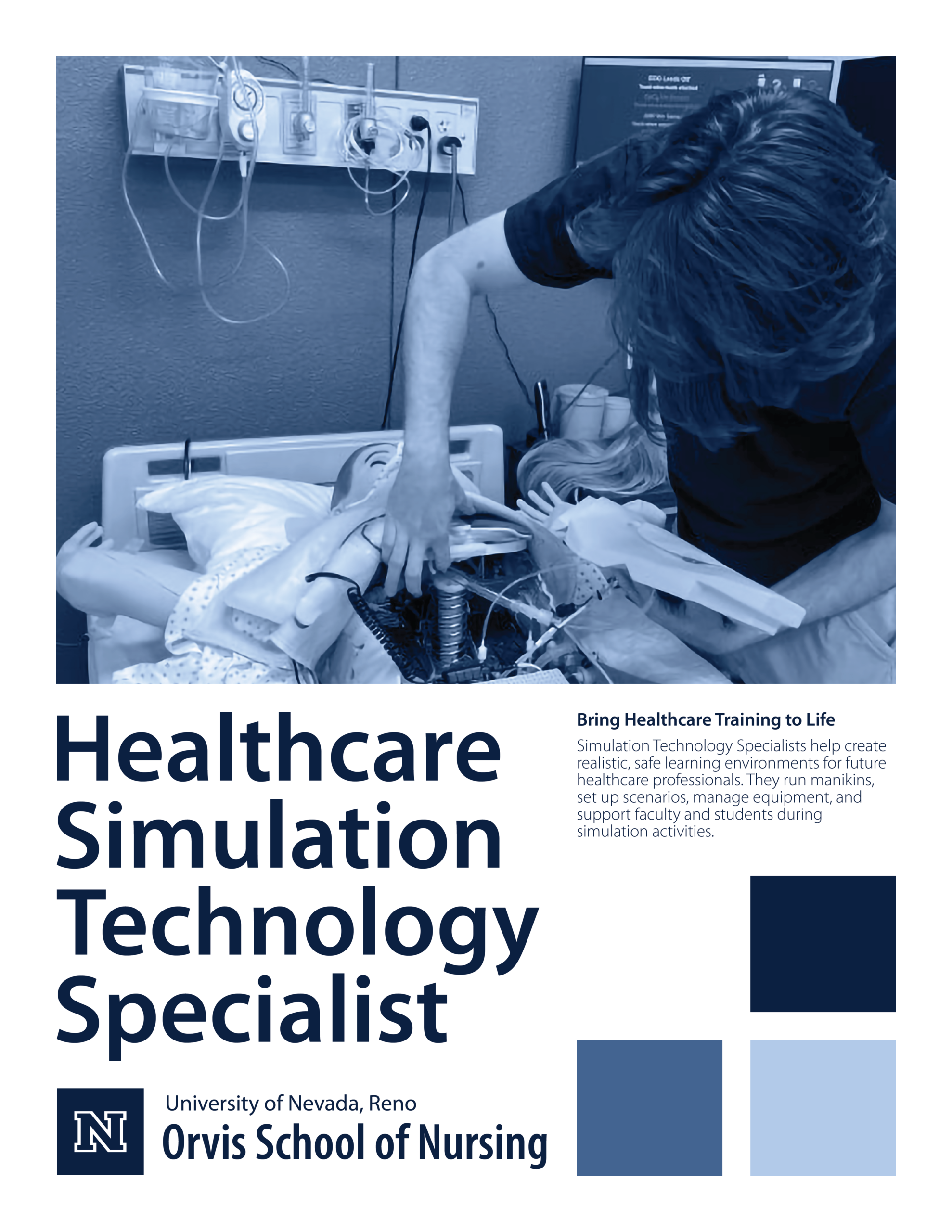
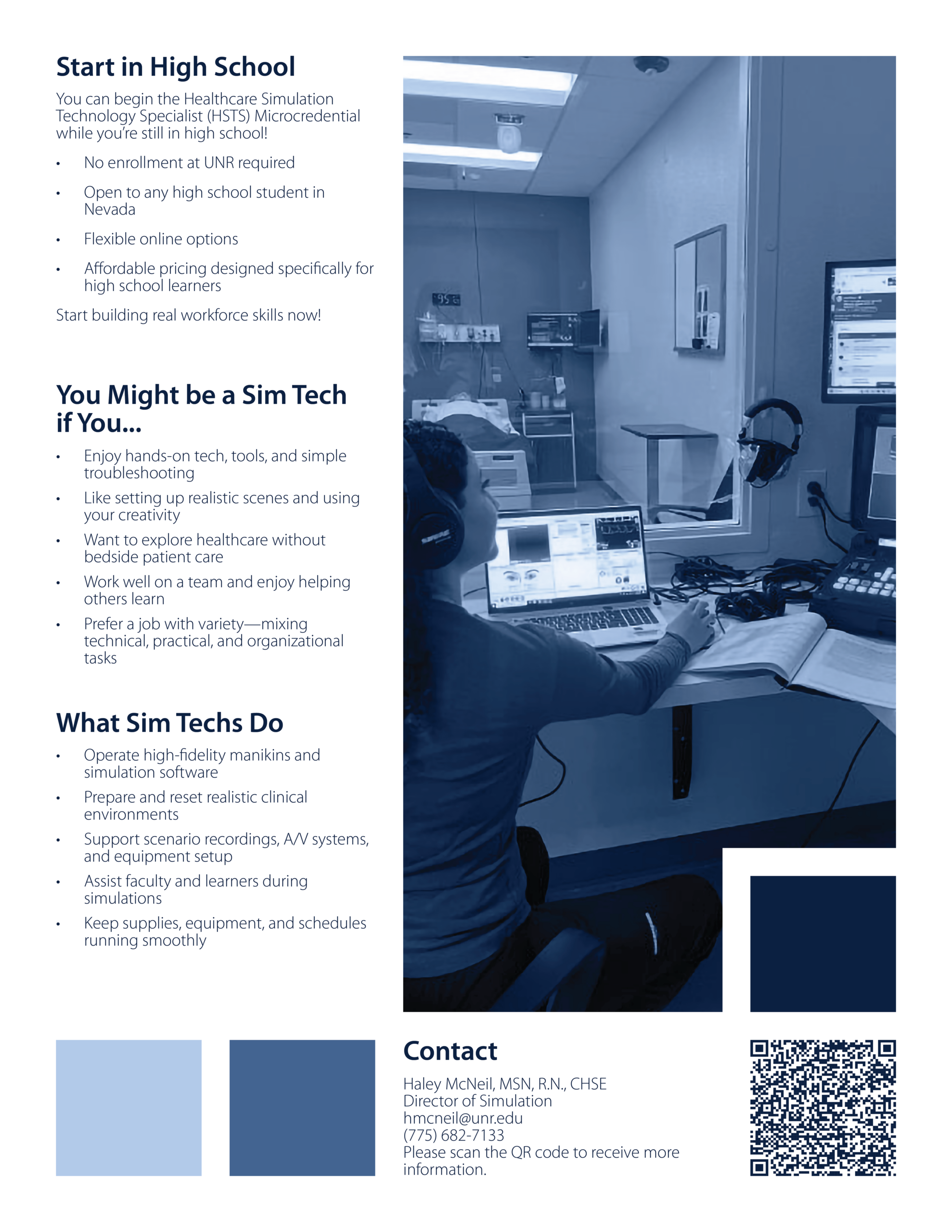
I also wanted a consistent layout system so our materials felt intentional, planned, and calculated instead of random from piece to piece. To do that, I aligned everything on a Swiss grid, which is a time-proven classic and just makes layouts look effortlessly clean when it is done right. Another major consideration was the reality of the turnaround time. People wanted these handouts ASAP, which meant we could not rely on a traditional print shop. I designed them so they could be printed on cardstock in the main Orvis office and still look sharp. The layout avoided full-bleed images so we would not end up with awkward borders from in-office printing, and I leaned into a monochrome color theme so photos would not look washed out or weirdly desaturated on a standard printer. On top of all of that, everything still had to align with the University’s design standards, so the final look balanced being more modern and bold while still staying on-brand and appropriate.
It should also be noted that I was not just in charge of the design for these, I was also helping develop the copy and deciding what information was actually relevant enough to include. A big consideration was that prospective students do not have time to read a wall of text, so the content needed to be clear, informational, and straight to the point. I focused on pulling out the most important takeaways and presenting them in a way that was easy to scan, so even if someone only spent a minute with the handout, they would still walk away with the gist and the key facts.